
Celeb Secrets: Four Questions That Reveal Their True Character
Celebrities embrace the latest personality testing trend: a concise quiz with four...
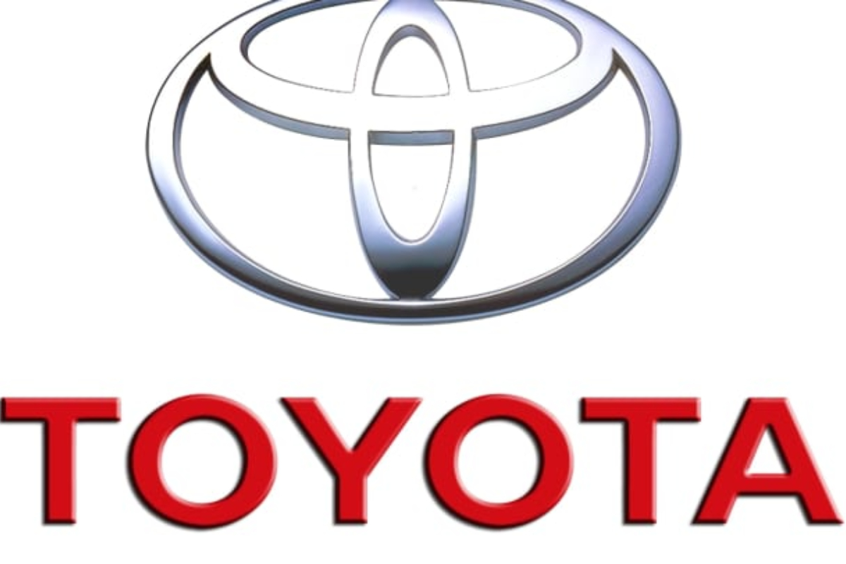
Toyota Logo Unveils an Unexpectedly Cute Message
Toyota, known for producing a staggering 10 million vehicles daily, has caught the attention of its fans with a delightful surprise hidden within its iconic logo.
Since its establishment in 1937 by Kiichiro Toyoda, the renowned automotive manufacturer has been identified by a symmetrical arrangement of three ovals.
However, beyond its instantly recognizable design, the logo holds a heartfelt message from the company to its valued customers.
“Each oval is drawn with different stroke thicknesses, pointing to Japanese calligraphy art and culture. The space in the background within the logo is meant to exhibit the ‘infinite values’ which Toyota stands for.
“These are superb quality, value beyond expectation, the joy of driving, innovation, and integrity in safety, the environment, and social responsibility.” Toyota updated its logo in July 2020 in Europe to signal a new era for the brand as it transitioned from a car company to a mobility firm.
Four fundamental principles guided the shaping of Toyota’s logo: forward-thinking, mobile readiness, a heightened sense of premium quality, and maintaining consistency across all business units and sub-brands.
Didier Gambert, Toyota Motor Europe’s vice president of sales, marketing, and customer experience, said: “We developed the new brand visual design with ‘tomorrow’ in mind. Our focus was on enabling ever-better customer connections, allowing them to keep pace with Toyota’s rapid expansion of electrified vehicles, mobility services, and online retailing. The design was re-purposed to better connect with customers across diverse touchpoints.”
Commenting on the revelation, one social media user said: “I just realized the Toyota logo is genius,” while another added: “As a kid, I always thought it was a guy wearing a cowboy hat.”
A third user said: “Dang, I never realized your logo had such a deep meaning. I thought it was just a bunch of circles arranged so that they look cool”, and one more user added: “When looking at the logo on my local dealership recently, I also saw an Angel in the logo.” Another user said: “This is so cute – adorable.”
Catch all the Business News, Breaking News Event and Latest News Updates on The BOL News
Download The BOL News App to get the Daily News Update & Live News.