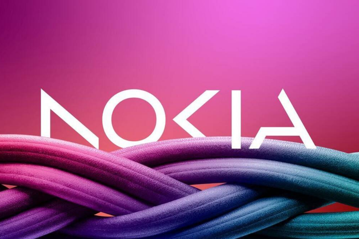
- Nokia has changed its logo for the first time in 60 years.
- Pekka Lundmark’s telecom equipment division sketched out a three-phase plan reset, accelerate, and scale.
- Pekka Lundmark said the old logo made consumers think of smartphones.
Nokia has changed its logo for the first time in 60 years. Pekka Lundmark, the CEO of Nokia’s telecom equipment division, sketched out a three-phase plan: reset, accelerate, and scale.
After completing the first phase of the plan, Nokia will now concentrate on accelerating, and it will change its logo for the first time to reflect the strategy shift.
Nokia is getting rid of the blue colour in favour of something more fitting for the situation. Unfortunately, no precise colour palette has been assigned. The new logo consists of five distinct forms that form the word Nokia.
According to CEO Pekka Lundmark, the old logo made consumers think of smartphones. The new appearance and feel, on the other hand, indicate that Nokia has emerged as a “business technology company.”
“There was an association with smartphones, and nowadays we are a business technology company.”
Nokia will focus on selling equipment to other businesses in addition to expanding its telecom equipment business.
They include private 5G networks and automated factory equipment, positioning the company as a competitor to Microsoft and Amazon in the industry. Lundmark stated that Nokia is thinking about expanding and developing in other sectors as well.
[embedpost slug=”/nokia-x20-price-in-pakistan-features-3/”]