


Poco M6 Pro’s official design has been revealed in new renders
The Poco M6 Pro will be released in India on August 5th....


Oppo changes its iconic green logo to a new design
Oppo has quietly chosen to abandon its well-known green logo hue, shifting to incorporating black accents going forward. Internet users in China observed alterations in profile pictures on Weibo, prompting the company to respond to a fan. They mentioned that while green remains a crucial element of the brand, it will be employed in “interactive visual designs to enhance every moment where the brand engages with users.”

Oppo changes its iconic green logo to a new design
The company’s statement also indicated that moving forward, the logo will gradually shift towards a monochrome appearance, thereby not solely eliminating green but all colors. This change is evident on the company website, where the green squircle has disappeared and the pages have undergone a redesign.
Oppo changes its iconic green logo to a new design
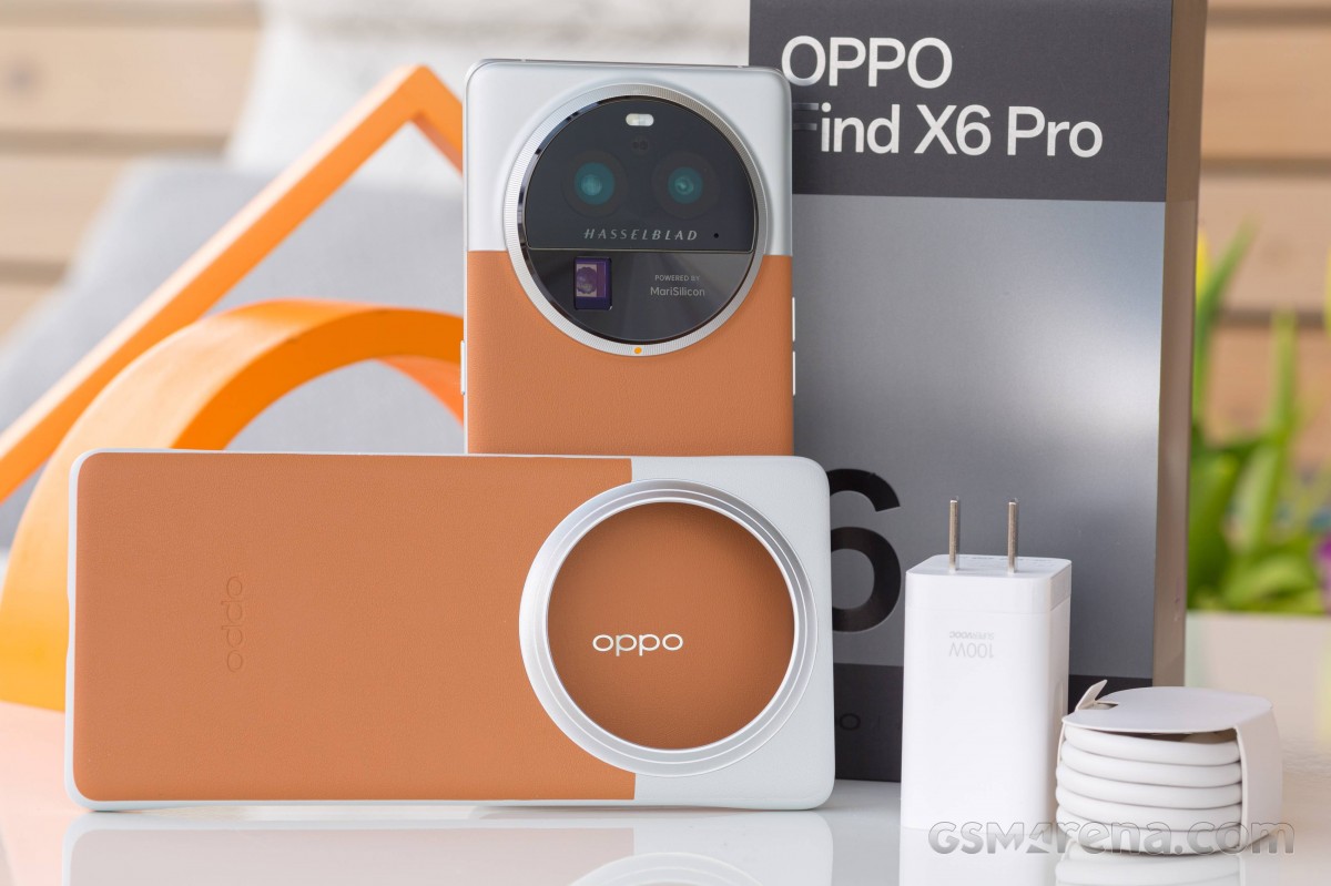
In hindsight, the process of phasing out the green logo from Oppo‘s marketing efforts has been ongoing. The company is now favoring white lettering, which can be adjusted to match various visual components. For instance, the Reno10 Pro’s purple version showcases violet Oppo letters on the packaging, while the logo appears in silver on the Find X6 Pro.
To stay informed about current events, please like our Facebook page https://www.facebook.com/BOLUrduNews/.
Follow us on Twitter https://twitter.com/bolnewsurdu01 and stay updated with the latest news.
Subscribe to our YouTube channel https://bit.ly/3Tv8a3P to watch news from Pakistan and around the world.
Catch all the Sci-Tech News, Breaking News Event and Latest News Updates on The BOL News
Download The BOL News App to get the Daily News Update & Follow us on Google News.